Are lightweight components really what you need?
- What drives productivity in today’s web applications?
- Can we build high-productivity applications with lightweight components?
- Wrong performance focus
- There is a reason not to load 10,000 rows in the database, and it’s not the browser.
- 10,000 rows is not a reasonable upper boundary – nor is 100,000.
- Client-side filter & sort is achievable with Isomorphic grids – but not with lightweight component grids.
- You can only render rows faster by removing features.
- Productivity comes from feature-rich components, not lightweight ones.
- Forgetting something? Server integration!
- Mixing components never worked and still doesn’t
- Wrong performance focus
- So are lightweight components always a good thing?
Business applications improve productivity.
Improving productivity is why applications exist and why we are all employed to provide them.
However, as developers, we sometimes get excited about new technologies and the benefits they claim to have. For example, a basic grid component with a very small amount of source code sounds very appealing. However, this simplicity is the wrong thing to focus on because lightweight components impair productivity due to their lack of features and damage the real-world performance of applications. Let us explain.
What drives productivity in today’s web applications?
End-user productivity – from a platform perspective – is driven by:
- Advanced UI features (i.e., performing activities with fewer steps / clicks / screens / actions).
- Performance & scalability (i.e., getting the result of each activity faster).
Without these critical deliverables, you will always struggle to get product adoption and the efficiencies and improvements that the application was written for in the first place.
Can we build high-productivity applications with lightweight components?
There are a number of areas where lightweight components consistently fall short or fail to understand actual enterprise requirements.
Wrong performance focus
People are excited about lightweight components, particularly grids, which claim to be able to render 10,000 or more rows in a reasonable time in the latest browsers. Developers often think this means that they can skip implementing data paging and can use client-side filtering and sorting to improve performance. The reality is:
There is a reason not to load 10,000 rows in the database, and it’s not the browser.
It’s not important that a grid can render a lot of rows all at once. The purpose of loading rows incrementally was always to avoid unnecessary database and application server load and avoid wasted bandwidth.
10,000 rows is not a reasonable upper boundary – nor is 100,000.
Business data sets routinely get much larger, especially when you consider administrative interfaces that look at data from many users at once. If you ship an application that expects to load all data upfront, it will break in production as data volumes go higher than you had assumed.
Client-side filter & sort is achievable with Isomorphic grids – but not with lightweight component grids.
Our Adaptive Filtering technology automatically switches to client-side sort & filter when data sets are smaller, so you can handle extremely large data sets and reduce server load and bandwidth use. This capability is why Isomorphic grids dominate performance comparisons that simulate actual end-user behavior.
You can only render rows faster by removing features.
Isomorphic’s grid component uses a complex HTML structure because it supports a huge variety of productivity features, like auto-sizing of both rows and columns, on-the-fly column freezing, row-spanning cells, components embedded in rows, on-the-fly grouping, as well as many developer override points that require particular HTML structures in order to work.
We know exactly what simplifications would result in rendering more rows per second. We intentionally don’t apply those simplifications because they would remove productivity features while not actually improving real-world scalability or performance.
Productivity comes from feature-rich components, not lightweight ones.
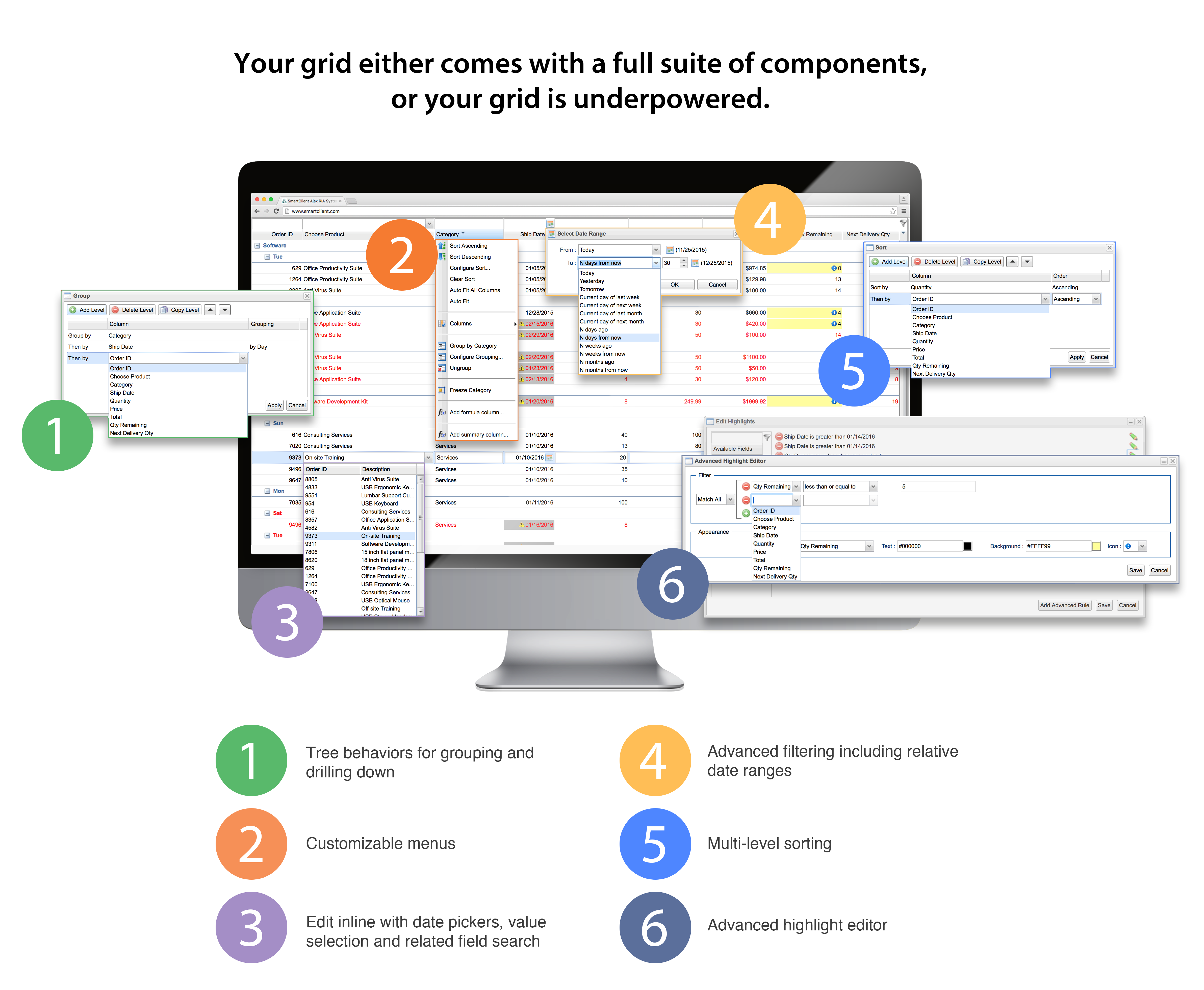
Consider grid components. End-users need capabilities like edit inline, freeze columns, grouping, sorting, formula columns, adaptive filtering, hiliting, export, drag & drop, etc. Without these and other features, performing simple tasks requires end-users to complete multi-step processes. For example:
- With edit inline: End-users click a row or cell, edit the data, then move on.
- Without edit inline: End-users select a record, click an edit button, are taken to another screen, perform the desired update, save the record, and return back to the starting point – hopefully without losing context.
Without feature-rich components, your application can become a frustrating time sink rather than a productivity tool. This is all too often missed with the adoption of lightweight components.
Forgetting something? Server integration!

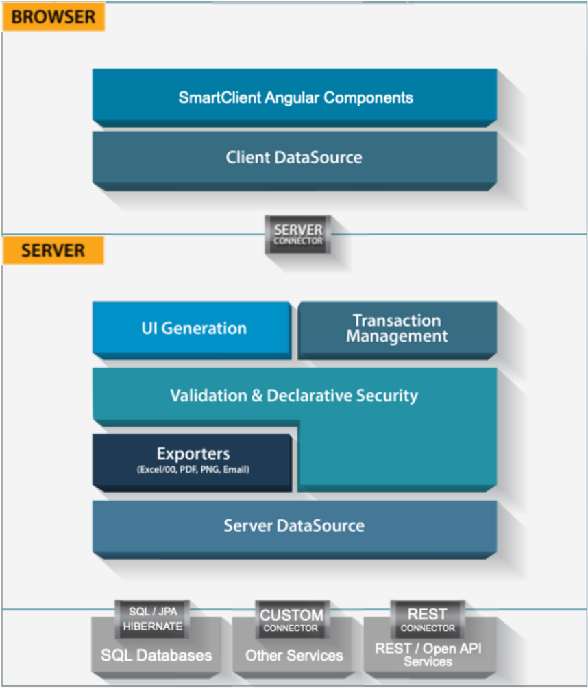
Some of the most powerful features in modern UI technologies span both the client and server. Examples from Isomorphic Software’s technology include:
- Single source validation & security rules. Validation rules declared in one place are enforced on the server (for security) and the client (for immediate feedback).
- Automatic UI generation. Grids, forms, and other components can be automatically configured from server-side artifacts such as Java beans and database tables, greatly reducing redundant declarations and making applications easier to maintain.
- Exports. Isomorphic’s UI components know to coordinate with our server framework to export themselves and their data to Excel, PDF, and other formats. Every application needs this!! it can be a huge effort to build from scratch.
….. and these examples only scratch the surface of the features that a modern client & server framework provides.
Starting from a lightweight components, client-only framework puts you years behind the state-of-the-art solutions for UI technology, before you even consider which UI components to use.
Mixing components never worked and still doesn’t
Most of the new crop of lightweight components frameworks emphasize the ability to plug-in components from different sources, so you can get the best of each component type. This should all work since they share a common data-binding system, right? Wrong, unfortunately:
Accessibility requires intensive coordination between components about tab order, modality, and ARIA markup.
Really trivial cases where just a few rudimentary components are combined will appear to work; however, when you have a lot of instances of dynamically changing tab order, multi-level modality, and the like, there’s no way to get components from different sources to work together and actually pass accessibility tests.
Skinning conflicts.
Each component has a slightly different look and feel, and it can take a lot of work to correct the mishmash of different fonts and styles so that an application looks reasonably consistent.
Especially when fonts are made consistent, the sizes of various controls and sub-controls used in the app may need to be adjusted to fit the adjusted fonts.
Also, some frameworks make conflicting assumptions about CSS they can globally apply to the whole page, breaking other frameworks or components on the same page (e.g. Bootstrap).
Export and print support.
Export and print support is a rare feature among lightweight components. Yet, most applications require it, and just one component lacking support can ruin the ability to print or export a particular screen or report.
Internationalization and localization.
Pulling components from multiple sources typically means that localization work has to be repeated for each component, as every component needs the local word for “OK” or to be told what date format to use.
Inconsistent quality and endless evaluation.
There is the practical consideration of whether it makes sense to constantly hunt for lightweight components. One grid has inline filtering but no frozen columns. Another has frozen columns but no ARIA support for inline editing. A third has a nice date filtering interface, but it looks and operates completely differently from a date filtering interface you’re using outside of the grid, which will surely lead to user confusion.
Support.
Even if you succeed in finding a workable set of lightweight components, you may discover later on that your bug reports are ignored by one team or another. If support is even available for your chosen components, how many separate support agreements will you need to purchase?
What about the many bugs that are not quite just one vendor’s fault? For the many single-component OSS projects, is there any reason to think the project will last as long as you need to maintain your application?
So are lightweight components always a good thing?
No, they’re not!! Especially when you’re up against true enterprise heavyweights. SmartClient has the richest set of UI components available, coupled with deep server integration to bring productivity and performance to your enterprise applications, with no need to look elsewhere.


