User Interface Insights
We recently saw an upward trend in requests for increasing the default size of our UI controls and fonts. On one hand, this made sense. A bunch of technologies have emerged that, while they certainly don’t have the capabilities of SmartClient, they do have simplicity in their interface that many users like.
On the other hand, many Isomorphic customers (pharma, banks, research, technology, etc.) build data intensive applications. Being able to display as much data as possible on the page, then filter, slice and dice on the fly, is very important to them.
How could we be sure to strike the right balance between data density and resized controls? Well, we asked you of course! If you responded to our survey, thanks again!
Note: The survey was sent to those that, during registration at www.smartclient.com, opted-in to receive our emails, and had either purchased a license or downloaded our LGPL edition.
Here are a few insights from the survey results:
The Bigger UI Use Case
We asked if you wanted larger UI controls, and if so, how would you use them. The responses were broad:
- 41% of respondents wanted increases ONLY in selected circumstances such as in a dashboard or simple form.
- 40% wanted increases throughout their applications.
- 19% of respondents didn’t want anything to change.
Since large portions of respondents support conflicting options, we knew that to meet everyone’s needs, we would have to implement a flexible solution. You may have noticed in our last release (11|6) that we introduced capabilities to make it very easy to resize controls and fonts. Learn more here.
How Big is Big Enough?
For a long time, the default size of SmartClient UI controls was 22px. For those survey respondents that preferred larger UI controls, we asked how big they should be.
Interestingly, 18% of survey participants that indicated that they wanted an increase, but selected 22px (unchanged) as the size they preferred.
The most common survey response (31%) was for an increase to 26px.
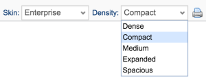
You can see this change has already been made in our showcase. In fact, you are now able to select from 5 variants.
It is interesting however to look at this question across all survey participants:
If we take into account those that said they did not want an increase in UI control / font size throughout their applications, there is a complete turnaround and 68% want the UI control size to be 22px (unchanged). This actually makes sense given that these are SmartClient customers with typically a high density of data in their applications.
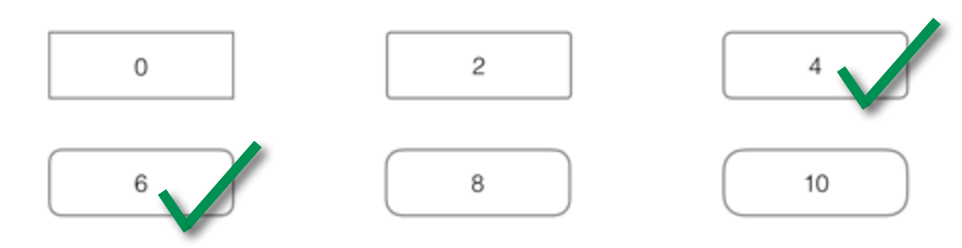
Round vs. Square Corner Consensus
Most respondents wanted a medium level of rounding of corners. On a scale of 0-10, about 4-6 were by far the most popular.
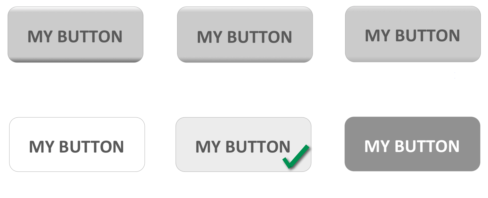
Flat versus Gradient
We asked how UI Controls should look. Overwhelmingly (61%), the response was that they should be flat.
Interestingly, there was a strong correlation between users that didn’t want UI controls / fonts to be increased, and also wanted UI controls to have some level of gradient.
Don’t worry. When we roll out our new UI skins, there’ll be something to keep everyone happy.