Even More SmartClient 11 | Smart GWT 6 Features
We blogged a few weeks ago (click here) about the first batch of features in SmartClient 11 | Smart GWT 6. Below are a bunch more. Enjoy!
Beautiful input controls
First of all, we’ve overhauled the appearance of our form controls to match current design trends and take advantage of CSS3 features like box shadows and transitions, that are now supported across all common browsers.

To check it out for yourself, see examples here, and across many of our other samples in the pre-release sample site.

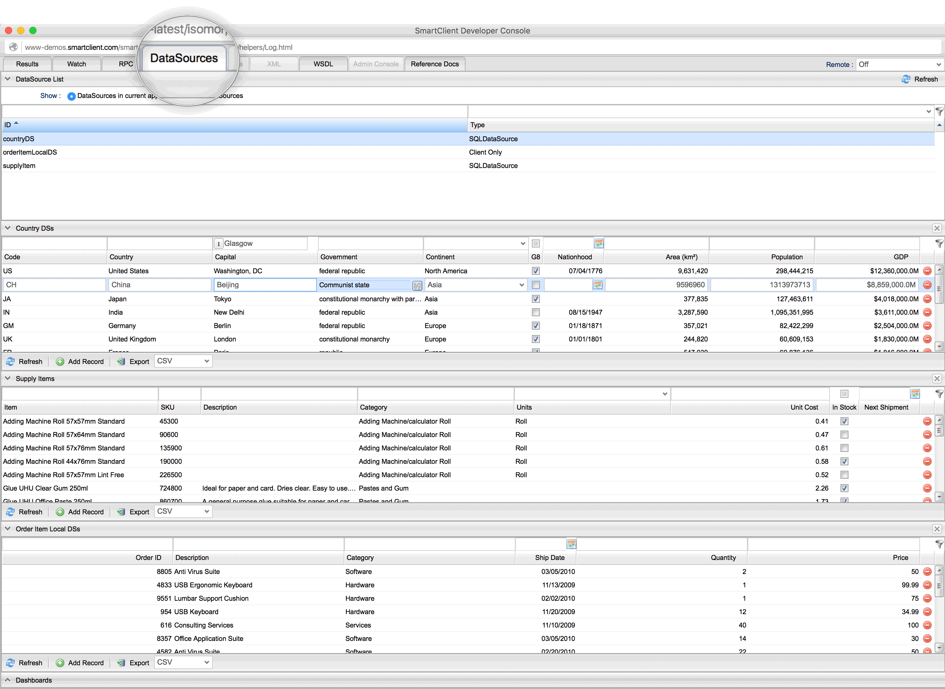
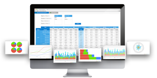
DataSource Navigator & Dashboards in Developer Console
You will find the new “DataSources” tab in the Developer Console to be an extremely useful tool. It enables developers & admins to view, search and edit data for any DataSource in your application, without being limited to the UI intended for normal end users. Leverage it as a:
- Development tool
- Troubleshooting tool for live, deployed applications (admins only)
- Security auditing tool (log in as an ordinary user and perform operations to test for correct server-side enforcement of security rules).
It even includes the ability to save a dashboard consisting of grids configured to show interesting data, allowing admins to quickly bring up key information such as recent orders, lapsed subscriptions or other metrics that may otherwise have required a dedicated reporting tool to make available.
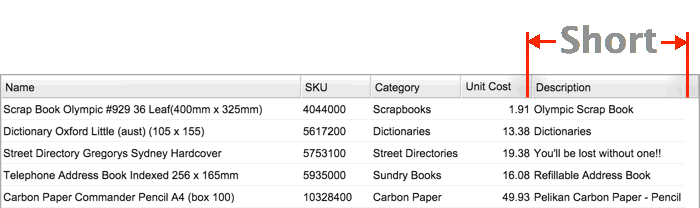
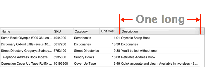
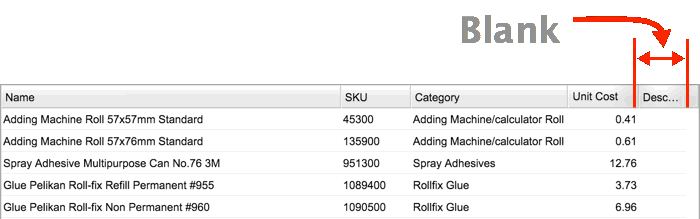
min and maxWidth for ListGrid auto-sizing
Space in tables is premium. You want to see as much of the data is possible at one time, but this is difficult when the size of returned data is dynamic. To resolve this, SmartClient 11 | Smart GWT 6 gives you precision control over column widths, making it possible to:
- Autofit perfectly to typical data, but not expand for unusually long values
- Impose a minimum size for a column that allows a title to be partially clipped (e.g. showing “Desc” may be sufficient for “Description”
Let’s look at an example:
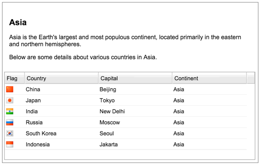
A) The Description column in the table below only has short values. As such, the column width is narrow, taking up as little space as possible without truncating the values.
B) Below, one of the values in the Description column is very long. The column is wider than before, but rather than make the column unusually wide, that single long description is truncated.
Here, all of the values in the Description column are blank. The column is therefore made as small as possible, even clipping the column title to ‘Desc …’ to free up as much space as possible.
Component min and max heights & widths
Get more control over layouts with minHeight and minWidth properties on components. This makes it easy to implement scenarios like:
- Components that should start scrolling if they grow beyond a certain size
- Preventing components from becoming too small to be usable
- Modal dialogs that should fill the screen, but not become overly large
Let’s look an example:
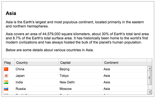
When space is not an issue, the description text and the complete table with all of the data is displayed in the layout as shown below.
As the amount of description text grows, there is less space for the table. The amount of space available for the table is reduced. the complete table is still displayed, but the user must scroll to see all rows of data.
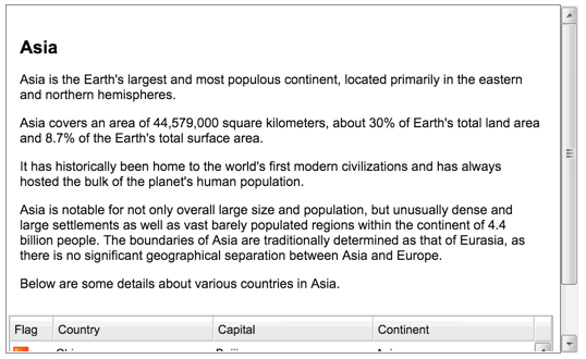
As more description text is added, there comes a point where further decreasing the height of the table does not make sense. At this point, the table is pushed downwards and the right-hand scroll bar provides navigation to it.
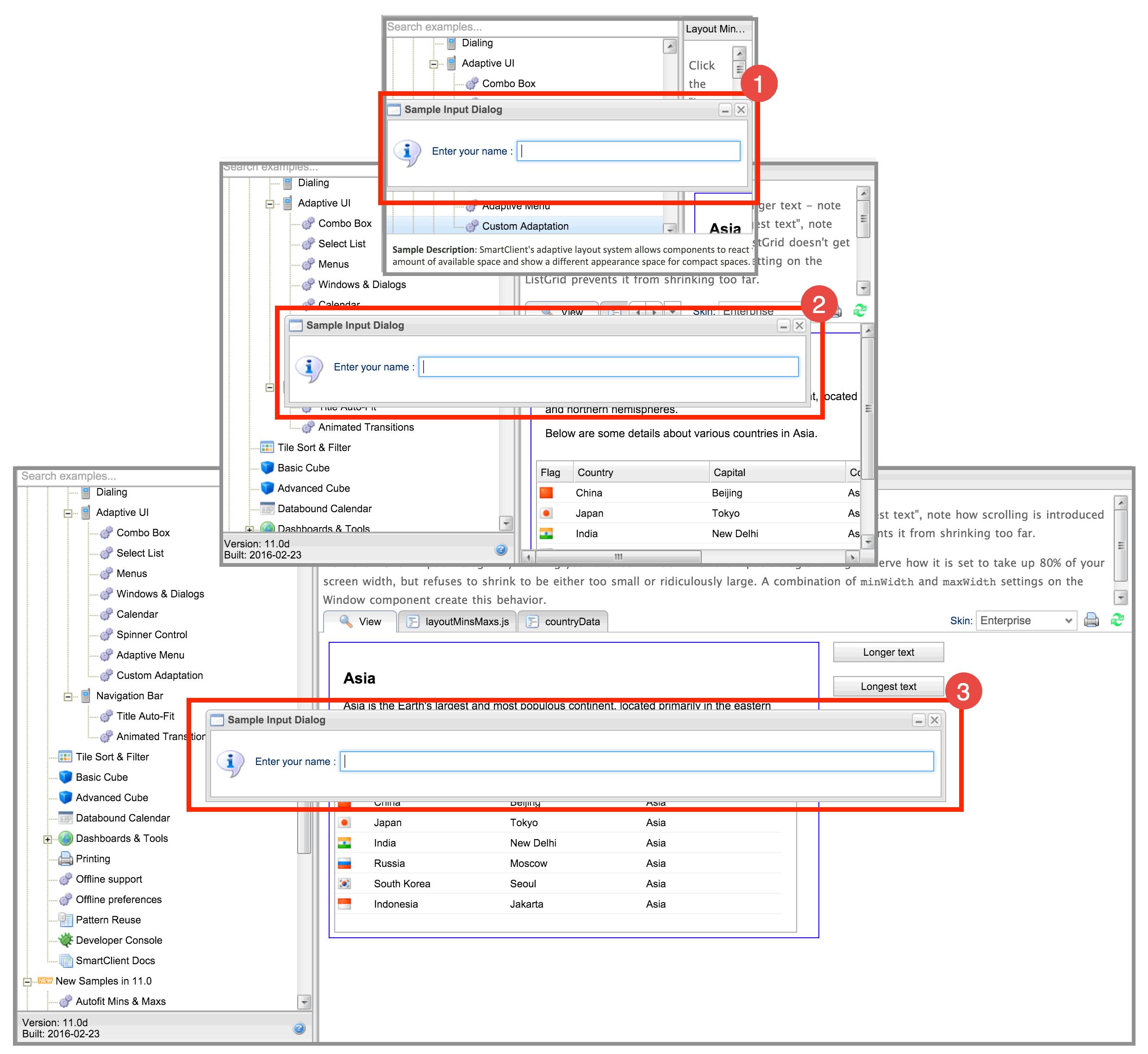
This feature also provides the ability to control the size of modal dialogs. In the example below, the modal dialog has been set to take up 80% of the width of the screen. The size of the modal dialog therefore changes as the screen is resized. However, we don’t want it to get too small, or too big. Let’s look at the example:
- At first, the screen is very small. The dialog has to take up the full width of the screen to be readable, and it prevents the screen from being sized smaller.
- As the screen gets larger, the modal dialog takes up 80% of the width.
- As the screen gets larger still, there comes a point when it is no longer necessary for the modal dialog to grow further.
More Miscellaneous Features
| FormItem icons can now be “inline” on older IE (IE7 and up). Previously, this feature was limited to IE10 and above |  |
FormItem icons can now use text glyphs instead of CSS images or Data URLs, allowing fonts to be used as sets of icons |
|
| Space left for FormItem hints can now be explicitly controlled, to prevent excessive wrapping when forms are horizontally shrunk | |
|
Maximum file sizes are now validated within-browser (on browsers where this is possible) to avoid uploading large files only to have the file rejected after the upload completes
|
|
| Excel exports can now render “datetime” values to a particular timezone (Excel has no support for timezone-independent datetime values) | |
| DrawPane and DrawItems now support zIndex (stack order) manipulation, at creation and on the fly | |
| DMI can now target Java CDI (Contexts and Dependency Injection) beans | |
Use our Pre-release features NOW!
Download our cutting-edge development pre-releases to get started using our new features now!
As always, please send us any bug reports or feedback in the Forums. Please be clear about what product and version you’re using when reporting issues.
Best,
The Isomorphic Team
