Introducing the CubeGrid
What is a CubeGrid?
The CubeGrid is a high-end data analysis engine that wraps OLAP cube functionality into a single interactive grid component for fast access to multidimensional data and calculations. The CubeGrid enables you to view, analyze, and extract data using any standard data source from multiple perspectives. They are typically used as front-ends for business intelligence, analytics and reporting applications to empower your teams to generate powerful reports, identify key patterns and trends, and plan ahead using real-time data.
The CubeGrid allow users to perform sophisticated analysis of very large data sets to rapidly answer multidimensional analytical (MDA) queries. Cubes allow the user to re-organize or re-orient the way information is viewed on the fly. Effortlessly slice, dice, drill in and out, roll-up, and pivot data according to your needs.
Components such as the CubeGrid are often called crosstabs for their cross-tabular display of data dimensions in nested rows and columns. They are also called pivot tables for their ability to pivot dimensions between rows and columns to view a data cube from different perspectives. Please see below for an explanation of the terminology associated with our CubeGrid component, or read the documentation for more details.
Terminology
The CubeGrid refers to the dimensions of a data cube as facets, the possible values in each facet as facet values, and the values within the data cube as data values or cell values. Equivalent terms that are commonly used in data warehousing or business intelligence systems include:
- facet: dimension, attribute, feature
- facet values: dimension member, attribute value, feature value
- cell value: data value, metric value, measure
What is a facet / dimension?
By facet we mean an aspect of data that is independent of other aspects of data so that combining values from any two facets makes sense. For example:
- Two facets that are independent are “quarter” and “region”. It makes sense to combine any quarter and region. i.e. First quarter sales for the West region.
- Two facets that are NOT independent are “city” and “state”. It’s doesn’t make sense to combine any city and state. i.e. San Francisco and Florida. In this case, a tree facet [getIsTree] that combines ‘city’ and ‘state’ values would be appropriate.
Features
- Add and Remove facets on the fly.
- Expand or Collapse within facets and across facets.
- Drag-and-Drop re-arrangement and pivoting of facets.
- Interactive Operations such as select, resize, reorder, minimize, maximize, or auto-fit of columns.
- HTML5 Charts with mobile supportfor instant graphical analysis.
- Frozen Headers constrain scrolling to one axis (row headers only scroll vertically, while column headers only scroll horizontally) so that values for the visible cells are always displayed.
- Load-on-Demand system only loads visible data.
- Works with Standard ISC data sources.
In today’s discussion we’ll cover adding facets, removing facets, moving facets, and HTML Charts. If you’d like to follow along, please see our Interactive Analytics example.
- Add Facet: [underlying API is ‘addFacet‘]. Facets can be added to the view, exposing more detail, by dragging the menu buttons directly onto the grid, or into the ‘Row Facets’ and ‘Column Facets’ listings.
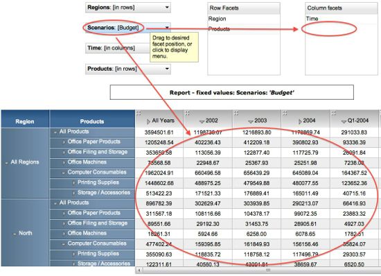

- Remove Facet: [underlying API is ‘removeFacet‘]. Facets can be removed from the view by using the menus to set a facet to a fixed value. For example, use the ‘Regions’ menu to show just data from the West: ‘Regions -> Fix Regions Value -> All Regions -> West’.
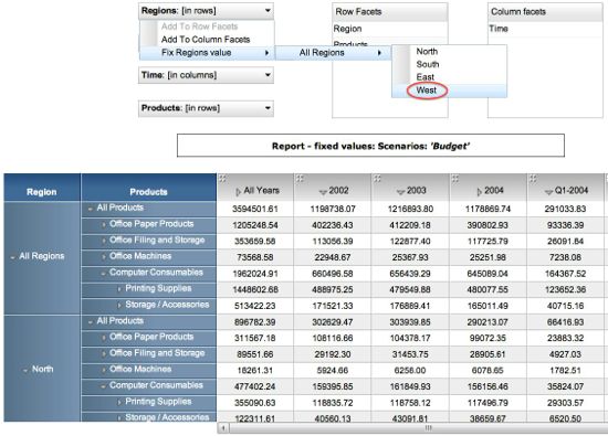
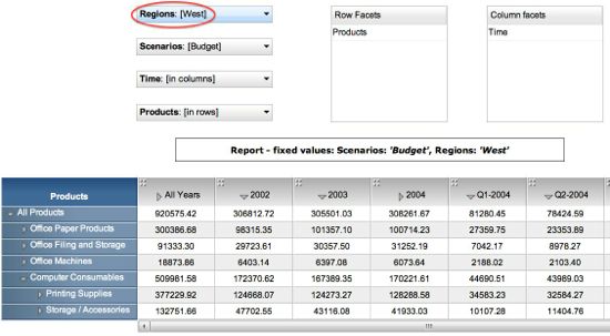
- Move Facet: [underlying API is ‘moveFacet’]. Facets can be moved or rearranged by:
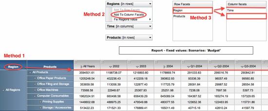
- Drag-and-drop of a facet label directly on the grid,
- Toggling the contextual menus from [in columns] to [in rows] (or vice versa).
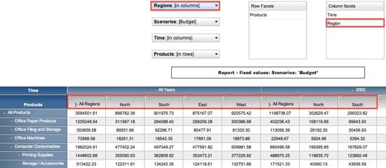
- Drag-and-drop of a “Row facet” or “Column facet” in the corresponding menus. Please note that you can stack facets in any preferred alignment on either axis (i.e. in the example below I can move the “Region” facet from rows to columns either above or below the “TimeÔ facet).
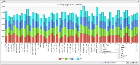
- HTML5 Charts can be instantly created with a right-click of any cell value, row header, or column header. This allows you to plot how each cell value may vary across any two facets (i.e. Sales of “Storage/Accessories” by “Time” and “Region” in the example below).

In addition, a right-click on the resulting chart enables further customization including pivoting, selection of chart type, fill, and stack. For further details, please read our post on HTML5 Charts with mobile support.
Interactive Examples
- Basic CubeGrid for SmartClient
- Basic CubeGrid for SmartGWT
- Advanced CubeGrid for SmartClient
- Advanced CubeGrid for SmartGWT
Pre-requisites
- The CubeGrid component requires the Power Edition with our optional Analytics Module.
Other topics such as data binding and load-on-demand will be covered in future posts. Stay tuned. Download the Smart GWT or SmartClient Evaluation to get started using our advanced analytics today.
Enjoy!
The Isomorphic Team

