SmartClient 7.0
This is a sneak peak at some of the features planned for SmartClient 7.0.
FilterBuilder / AdvancedCriteria
The FilterBuilder is a form that allows the user to input advanced search criteria, including operators on field values such as “less than”, and sub-clauses using “AND” and “OR” operators. See screenshot below:
As you can guess, the green plus icons allow the user to add new expressions and the button with a “+()” allows sub-clauses to be created, grouped by a logical operator. As shown, the user has set up criteria that will find South American countries with some kind of federal government, above a certain threshold of either population or gdp.
Part of what’s cool here is how neatly this component fits into the existing DataSource system. This is the actual code to create a FilterBuilder:
isc.FilterBuilder.create({ dataSource:”countryDS” });
The DataSource tells us what all the fields are, what all the field types are, and can optionally define what operators are allowed on which fields. The FilterBuilder is type-sensitive, so for example, for a field of type:”date”, the FilterBuilder will show a date picker automatically.
All of this is highly customizable and extensible – you can even define new operators, and define custom FormItems allowing users to pick values to compare against – eg, if you define a “zipCode” type, maybe the picker opens a Google map.
The DataSource subsystem provides the ability to actually execute the search, client-side or server-side as necessary, similar to existing simple criteria searches.
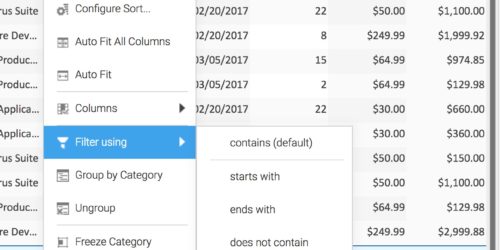
This is another core ListGrid feature that, like grouping, frozen columns, inline filtering, charting, etc, can be enabled for any grid by just setting a flag. The overall thrust here is to give end users the level of control over the data that ordinarily only the developers have access to. That way the developers take more vacations 🙂
TileList
This is a component that renders objects in a grid of tiles, frequently found in online stores, photo sharing apps, directory sites and the like. It has a rich set of UI interactions: rollover, selection (including shift- and ctrl-select), hoop selection, etc. Animations and drag and drop are planned as well.
But again what really shines is the databinding system – TileLists are a DataBoundComponent, so they use a DataSource and ResultSet just like a ListGrid. As with a ListGrid, you get a reasonable, type-sensitive default view by just binding to a DataSource, for example, fields of type “image” will actually show the image, as in the view above. Likewise, because the TileList uses a ResultSet, it supports the full set of sorting, filtering, data paging, and other data-related features supported by a ListGrid, with the same APIs.
The TileList also has incremental rendering support, so it’s safe for use with very very large datasets.
The upshot is, because of the uniformity in how a TileList is configured and accesses data, a menu item on a ListGrid for “Show as tiles” makes sense, and we’ll have a ListGrid flag that enables this with no further configuration.
.. these are quite substantial features, but they are just a part of what’s planned in 7.0. Stay tuned for more – we plan to make beta versions available via this blog for those who like to live on the edge.
Cheers


